Categories
Design

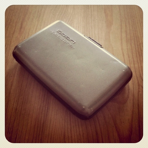
Ogon wallet

Ogon

I’ve had an Ogon aluminium wallet for over 4 years now, and when the time comes to replace it – which shouldn’t be for some years yet – I’m going to get another one.

It feels great in the hand, it’s around the same size as an iPod (Classic), made of smooth aluminium, comes in a variety of colours and is – when it comes down to it – a beautifully executed piece of design.

The concept is based around the fact that our 21st century financial life (so far) is dominated by cards. The Ogon wallet holds around 10 credit cards comfortably and… that’s it. One key litmus test for a new gadget is if it creates change in your life or lifestyle; the Ogon has been instrumental in my stopping carrying cash. While you can fold up a tenner and tuck it in somewhere, it actually feels like cheating, spoiling the purity of the concept.

I’m tempted to buy a second wallet, in a different colour, but why bother? Why would I want to change my cards from wallet to wallet? I can’t remember what the shelf life of my old leather wallets was, but I’m pretty sure that 4 or 5 years was the limit. I’m going to hazard a guess that the Ogon will beat that hands down and I’ll also suggest that longevity is probably the biggest barrier to sales for the company.

The Ogon wallet is one of those little things that makes you feel better about using it. It inspires comments from anyone who notices it. It’s just feels right. I’m planning to hold on to my Ogon wallet for as long as possible… then I’ll get another one. Rinse and repeat.

Categories
Community Design

Deconstructing Build

A collection of circumstances prevented me from getting along to Build Conference this year, much to my shame. And while videos of all the events – main talks and fringe events – are available, I know from experience that nothing can replace just being there, with your peers, having your head sent into a spin by the words of those preeminent in their field.

Andy McMillan – Build’s architect – has put together what he calls a ‘hand-crafted’ web design conference. Post-event his head must have been spinning with the torrent of praise coming his way. The thought he put into it was evident at every turn, with no detail left untended to. He is but one man yet made all this happen, the likes of which is rarely seen in Belfast.

The event has become something much bigger than it arguably set out to be. With a heavy emphasis on fringe and social events, spread out over a week, and with a much broader appeal than its humble tagline suggests, Build is as close to a design festival as it gets. Although a web conference, the wider design community beats a path to Build’s door and the whole shebang is spread over a week. Speakers’ topics this year extended to typography and the design process, while fringe events pushed the ‘web design conference’ description beyond breaking point. This was a festival of design by any other name.

I’ve been around long enough to see at least one national design body try and fail to motivate successive generations of designers and engender a sense of community. Through Build (and a not insignificant amount of other activity such as Refresh Belfast) Andy has achieved it within a couple of short years. Build it and they will come indeed.

I don’t know Andy and have no idea what he has in mind for future years, but his seemingly endless drive will surely result another landmark event in 2011. For what it’s worth I hope Build retains its unique ‘belfastness’. I also hope it ditches it’s increasingly inappropriate “love us because we’re small” marketing bent. Those tickets aren’t cheap, and for good reason. This is a first class design event, worthy of the title of festival, and deserves to be enjoyed and lauded far far beyond the often clique-y world of online design.

Forget #buildconf. Next year’s Twitter hashtag should be #buildfest

Categories
Design Process

Changing the way we work

We’ve recently been working on a major project with a client whose main office is 100 miles away. While physical visits are not an issue, sometimes we want to build up momentum working, and ask the client for feedback on the way. To facilitate this, we’ve elected to use two online apps for different sides of the design process.

For interface design visuals we’ve been working with Onotate, built by the folks at Rumble Labs. We’ve been using the just-out-of-beta app for feedback and collaboration with up to 6 other reviewers and editors. Onotate shows interface designs in the relevant context – a web browser – and notes can be added by dragging cross-haris across the desired area of the screen.

On the other side of the process, HotGloo has been our weapon of choice for wireframing and interactive prototypes. A brilliant tool, it makes creating interactive prototypes a breeze and, like Onotate, it can accommodate feedback in the form of onscreen notes.

We’ve found a number of benefits to using these tools, which apply to both of them.

– They encourage brevity: the comment boxes are just the right size and discourage lengthy essays on particular point
– They encourage more immediate feedback: it’s simple for the reviewer to leave a comment there and then rather than have to switch to an email window and remember everything there
– They help keep debate transparent: with multiple reviewers, it’s often too easy for the real discussions to take place in multiple emails, or in some other ‘unofficial’ forum. Threads can be created there on the tool, and keeps everyone focussed.
– They save on confusion: If someone else has already made a point, another reviewer is unlikely to repeat it

We had only made moderate use of these tools before now; beyond this point though, there is a good chance that the way we work will have been permanently affected, very much for the better.

Gonna be some changes around here

Kinda. Sorta. Started tinkering today trying to knock a new WP template together for the blog. Putting up a temporary template in the meantime. Perhaps not the most advisable method – working on the live site – but I’m thinking the stakes aren’t exactly high :/

Could be a few false starts along the way, suffice to say the blog will be in a state of flux for a wee while.

Categories
Books Design Simplicity

Laws of Simplicity

The recently rejuvenated UX Bookclub Belfast, brought to us by the good people at Front, had “Laws of Simplicty” by John Maeda as its September selection.

I wish this had been written when I was a student or graduate designer. I come from a generation of designers where the goal was generally to embellish, embellish, embellish, and that was evident in the the wave of websites which emerged when designers finally decided to engage with the web in the last couple of years of the nineties. This should certainly be a must-read for all design students. Here are a few of my random thoughts and quotes from the book:

The first edition came out in 2006; throughout the book Maeda makes repeated reference to the iPod as a paradigm of simplicity principles. I would love to know if this reverence extends to the iPhone which is – to me – a hugely complex device, one which seems to base its appeal almost exclusively on aspirational aspects, albeit its functionality is split into a large number of smaller, simpler modules.

“Good design relies to some extent on the ability to instill a sense of instant familiarity” – this is very true when one thinks of patterns in UX design, and yet some designers are ashamed of conforming to conventions. Doing ‘what everyone else is doing’ is generally perceived to be a bad thing, and yet it makes a vital contribution to usability.

“Ambience is the proverbial ‘secret sauce’” – very true in web design. Sometimes you can feel like you have very little room to make your mark in a ‘typical’ web project, whether the constraints be financial, or dictated by brand guidelines etc. Many small victories can be achieved through tiney details which contribute to the overall ambience.

“Synthesizing the ambient experience of simplicity requires attention to everything that seemingly does not matter”. Daaammmn. Favourite line in the book by far! I may not get a tattoo of it, but it deserves framing at the very least.

Maeda makes the point that “simple = cheap” to his mother (and others). I would suggest that simple = cheat to some; that somehow simplicity is less design. Sadly a viewpoint that is too often adopted by short-sighted clients!

“Simplicity is about subtracting the obvious and adding to the meaningful” – and here we have a key differentiator between simplicity and minimalism, which tends to be about reduction at all costs, something I’ve commented on before.

Overall, great book. The last couple of pages suggest to me that simplicity does not just appeal to us as designers, but as humans. For instance, I don’t believe that anyone wakes up in the morning and thinks: “Hmm. I think I need to make my life more complex today.” More exciting perhaps, or more fulfilling, but we will naturally be drawn to simplicity as a goal. And yet, I know I continue to fill my life with “stuff”, be it gadgets that I will never unlock the full potential of, books and magazines I may never read, which do nothing but add to the complexity of my life. Maeda lets us know that simplicity is a choice.

Without over-simplifying what Maeda offers, the book forces us to reconsider what is truly helpful, emphasising that more does not necessarily mean better.