Categories
Communication Design Research Simplicity UX

Practise like an expert, don’t communicate like one.

Peer networking in the design community is thankfully not the rarity it used to be. Where there were onceinfrequent events based around an occasional high-brow lecture or overly self-conscious ‘networking opportunity’ (ugh), thanks to any number of driven and enthusiastic individuals we now have conferences, unconventions, informal meet-ups and increasingly relevant and compelling talks.

Industry peers aside though, our professional communications take place with a number of other key groups: colleagues, clients and end users. It’s worth considering how we handle these conversations.

A couple of years back the excellent UX Bookclub Belfast covered ‘How to Use Your Eyes’ by James Elkins. Each chapter delivered a brief but compelling insight into the expertise of others. By deconstructing (amongst other things) a culvert, an oil painting and the Periodic Table, the book revealed hidden mechanics and meanings, inspiring admiration for those whose contributions you might not otherwise consider.

Had there been a chapter devoted to the makeup of a graphic user interface or how a web browser renders HTML, no doubt most in the web design industry could have articulated something to inspire  similar, admiring reactions from readers outside our sphere of activity. Indeed, expertise is (or should be) the minimum price of entry into the increasingly crowded Service Industry Club. A key question to consider then, is: how do we convey our knowledge to those we most need to engage with?

It just works

Almost everything we interact with or consume is the product of others’ technical mastery; their input is largely invisible, allowing us to go about our day without having to consider theories, systems or production processes. We care about these things, only in the sense that they just work without insight on our part.

The same goes for most experts we come into contact with. Be it a doctor or a car mechanic, we appreciate it when these people frame problems and solutions in the simplest possible simple terms, revealing more detail only when we request it.

Dumbing up

In UX design, and I’d suggest pretty much every other design discipline, expertise should manifest itself in simplicity. Or to rephrase that, the science we incorporate into what we produce should be invisible to a non-expert; and we should be able to communicate our expertise while remaining intelligible to the listener.

Too often we trip over ourselves to prove our competence rather than communicate it effectively. In many ways our ability blinds us. We should not berate the client for, as designers are so fond of saying, “not getting it”. Others do not see as we do. We are the ones who have the responsibility of making sure clients “get it”… whatever “it” may be.

So perhaps the truest test of our competence is how simply we can share it. When we discuss a project’s challenges and potential solutions with a client, make it simple to understand. Communicate like a true expert.
Categories
Communication Design Process UX

In (further) praise of personas

I felt this piece from UX Matters – Are Personas Still Relevant to UX Strategy? – and the string of great comments that follow it warranted a post here, based on personal experience forged in rigidly commercial environments.

To my mind, personas introduce a much needed human aspect into what can otherwise be a soulless, technical process that leads to an anodyne web site, app or web strategy. Rarely is the case for designing for people put as strongly as during a persona building exercise.

Personas also help to communicate strategy to otherwise sceptical stakeholders. When they are executed correctly, they ring true. They transform the “users” we so often refer to in design industry-speak into the clients and customers that your client recognises; they will know these people.

When it comes to crucial decisions of prioritisation, creating a hierarchy of needs for functionality can be greatly assisted by basing these decisions on the most important customers as a first step, rather than working with an exhaustive list of features or content.

The final, crowning glory of personas is their potential to bestow a lasting legacy. Beyond the life of an interface project, the organisation – your client – now has a valuable insight of their public. They will not be marketing personas (a very different proposition) and done badly, they are nothing but caricatures. But they can provide an enduring reference point for future communications. They inform your client about the people they currently, or aspire to connect with and how they prefer to interact. Above all they can imbue an organisation with the capacity for empathy.

Done right, you will change you client’s perspective for the better, giving them wisdom that they simply did not have before. They will know it and will thank you for it.

Categories
Design

Design for Everything, Everywhere.

As occurs frequently on Twitter, I was able to enjoy a conversation between two prominent figures of the design industry as they exchanged insights. This one really made me sit up and take notice. I’ll reproduce it in full here, short and sweet as it is:

@trentwalton: Lines between mobile, tablet & everything else are beginning to overlap to the extent that the terms are becoming useless.

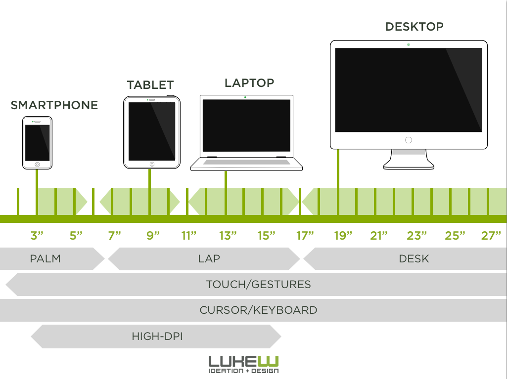
@lukew: wrist, palm, lap, desk, wall, mall sized screens. human ergonomics won’t change. devices will.
@lukew: as illustrated in: http://static.lukew.com/unified_device_design.png …

To save you a tap, click or cut n’paste, Luke Wroblewski’s graphic is reproduced below.

The new device landscape by @lukew

Any given day on Twitter yields a huge number of enlightening stats, info graphics and blog posts; frequently these will be stark reminders of how the device landscape is changing. Luke’s graphic however is a statement of fact – everything is changing.

Let’s just examine the message: device sizes, interactions, input devices and resolution are at once convergent and inconsistent. Add to the mix that context and location are unpredictable and it becomes clear that there is no convenient fallback. The desktop cliché, for instance, is now archaic.

Even the popular perception of responsive web design as a requirement to accommodate different viewport sizes must go. Our new reality affects (amongst other things) tap/click area, text size, image file size, colour palette, content length… Quite simply, it affects design decisions across the board.

There is no secret formula. The future of design on the web is designing for everything. Everywhere.

Categories
Process Research UX

UX & The Weight of Expectation

I’ve been thinking increasingly about the importance of user expectations in planing an effective user experience.

The greatest asset we have in going to meet the challenge of the user’s mental model is simply knowing it exists in the first place. A huge part of user research concerns itself with the needs of the user, but it’s important not to let this spill over into a hapless quest for what the user wants.

Don’t Give Me What I Want

User requirements are one of the basic tenets of user experience design. We know however that if the user got everything they wanted then we would almost certainly have a very messy interface to contend with, one overflowing with superfluous functionality and options. In short, what the user wants is often at odds with that they truly need.

This points to a very particular approach to user research.

In my own experience when the opportunity exists to talk to users in person the line of questioning should monitor the distinction between wants and needs very carefully. When talking through a particular system with a user group, the type of question I try to avoid is “what do you want to see on this page?”.

Love Me, Love My User

A quick aside here – people are amazing. Watching them in action on a website or an application is possibly the single greatest education a UI designer can have. They won’t always do what you expect them to do or what you want them to do. They will however do what they feel they need to do in order to achieve a goal. And that, of course, can be endlessly frustrating for designers.

In research as in life, framing a question can be as important as the question itself.

An open question such as “what would you like to see on this page?” (as a crude example) will garner very different responses from “what would you expect to see on the next page?”. The former can lead to some serous flights of fancy, where the entire web as we know it has to be re-engineered to match the heady goals set for what the site has to provide. Expectations are so much more important than perceived need.

Let Me Down Easy

When engaging with stakeholders, the same types of enquiry can help to keep a sense of promise to a minimum. “What do you want…” infers a degree of promise about what will be delivered. So much of stakeholder engagement is about inclusivity, giving people a platform to make contributions to a process that values their input. To over-promise in these situations is to mislead participants as to what will be done with their feedback. “What do you expect?” carries with it less of an overt sense of promise, and more one of discussion.

What’s New, Pussycat?

And what, you may ask, of innovation? If we only deliver in line with expectations, how does anything new enter the mix? Clearly, delivering “to expectations” is a lowly objective for any project. However, delivering what users expect is an imperative. The point is that we are not constantly seeking to reimagine the web. The time for reinventing conventions is gone. Lord knows we saw enough “innovative” – some might say wacky – attempts at elements such as navigation systems pre-2002. We have been left with a web that, generally speaking, conforms. And there is no shame in that. Most of our consumer products do the same; even the iPod delivered innovation in a very familiar package, building on the form factor that products such as the Walkman had created. Everyday innovation almost always arrives in tandem with the familiar. And delivering based on expectations does not preclude the element of delight.

Conclusion

Users do not like the unanticipated, but they will react positively to a system that simplifies a task. Strive for innovation of course, but be careful how you define it. And make no mistake – managing expectations is possibly the single biggest task faced by UX practitioners. As techniques such as responsive design gain traction, the issue of expectations grows ever more complex. In user research, assume nothing… and expect the unexpected.

Categories
Community Process

Adapting to responsive

Responsive web design has reached the grand old age of two and remains the single most important shift in design and development for the web since the advent of CSS.

Broken record

I have written previously about the dangers of dogmatic approaches, emphasising that we should move in the direction of responsive design increasingly and methodically. RWD is not however a be-all-and-end-all. It is not a magic bullet for multi-device deployment. Responsive images remain a challenge, advertising doesn’t sit well with a fluid layout and, regardless of how simple the approach is pitched as, the creation of a credible responsive solution takes significantly greater time than a single-resolution site.

Here comes the future

And yet it should remain the goal. We are clearly impelled to move to responsive as an industry standard. Some of the loftier commentary recommending multiple versions of websites appears frighteningly blinkered in its naivety. We are headed only one way in the medium to long term.

One foot in front of the other

However an all or nothing stance on RWD is an equally retrograde move. Speaking as a (ahem) “seasoned” designer, shifting to an adaptive approach has been an essential stepping stone in understanding RWD as a whole. Is it better to learn responsive as standard? Of course. For any new designers starting out: take this route and don’t look back. For those who have been around the block a few times, coming to terms with full responsive as a new way of approaching projects is to put it simply, difficult. I have yet to meet a designer in industry for any amount of time with a different view.

Money, money, money

I work in a commercial organisation and to remain viable in a commercial environment, we need to deliver effective outputs that surpass expectations – within a budget. Recently we’ve committed to producing adaptive sites as standard and deviating from this only where individual projects demand it. Not committing to fully responsive for the moment, our rationale is that doing something is better than doing nothing; not letting the perfect be the enemy of the good.

It’s not what you do..?

As I have said before, we’re getting there and should enjoy the journey. But whether it is acknowledged or not (and it isn’t) there is a purist agenda at work in some corners of the industry. Challenge some of the more vociferous opinions and there is usually a conciliatory climb down, but the inference remains: if you’re not producing fully responsive work, you’re falling short. My problem with this is simply that it places technique over results. The means do not justify the end. There are a number of responsive sites featuring what I would regard as unacceptable design anomalies at certain sizes, and they should not be given a pardon simply because of the way they have been constructed. An adaptive approach may yet be more condusive to better overall design on certain projects.

Conclusion

To repeat myself (again), why create divisions where none exist. We’re all on our way. Those who fail to come to terms with the changing landscape in web access are condemning themselves to history. For those who are moving forward, there is more than one way to do so.