Categories
Innovation Product Research UX

Embrace failure: inform research using a Pre-Mortem

“I have not failed. I’ve just found 10,000 ways that won’t work.” — Thomas A. Edison

One of the most effective ways to kick off a new initiative is to identify how it might go wrong. Similarly, when planning research goals and methodologies, awareness of potential weaknesses can help to establish immediate learning goals.

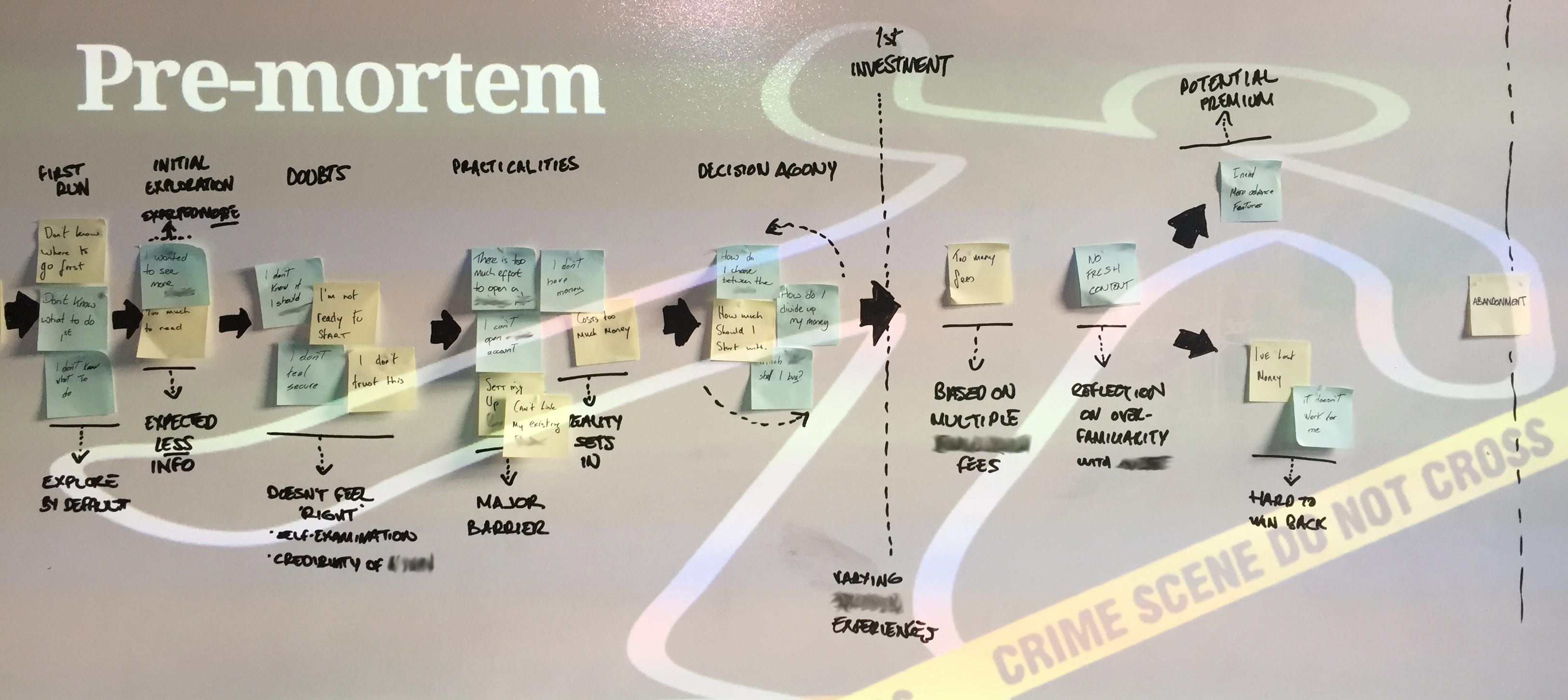
The Pre-Mortem is a well-established facilitation tool for use early in a project life cycle. As with a number of similar tools, the Pre-Mortem makes use of future projection to address the present.

If you are unfamiliar with it, the activity works like this: an assembled project or product team is asked to imagine a version of the future, a number of months down the line. The project/product/feature has shipped… and has been an abject failure. It wasn’t bought, it wasn’t adopted — whatever failure looks like for the issue in question. The Pre-Mortem then asks, simply: What caused this? Why did it go so wrong?

Eject the elephant from the room

Using a Pre-Mortem, a safe space is created for doubts, concerns or apprehensions to emerge and be expressed as a concern for the future, not as a gripe about the present, even though that’s what it very well may be.

In any team, there are often strongly-held points of view that can seep out throughout the course of not just a meeting, but an entire project. A Pre-Mortem actively invites such thoughts and feelings to be aired. These might otherwise fester, emerging only when there is a bump in the road — “we could have seen this coming!”.

Providing a forum that permits individuals to voice and record their concerns allows these strong opinions to be aired and treated with equity.

“When people have strong feelings about the topic, they often think of the meeting as a contest where their view — which they see as the correct one — should prevail. That leads them to try to convince others that their solution is the right one.”

– Roger Schwarz, author of ‘Smart Leaders, Smarter Teams’¹

While gathering doubts and concerns is a positive step in itself, these can be actively put to work as experiments to find (in Edison’s words) the things that won’t work.

A whiteboard from a pre-mortem workshop, with inputs captured against points in a core user journey
A pre-mortem workshop, with inputs captured around points in a core user journey

Step-by-step

  1. Gather input on post-its . Ask participants to list 3 main factors that will have contributed to the project failing (online this can be done with tools such as MuralMiro, or Google’s free Jamboard).
  2. Group the inputs — take time to find commonalities in the contributions, and collate them into groups.
  3. Identify themes —it may be helpful to think about these 3 categories²:
  • feasibility: can we build, scale and support this — usually this will have a technical skew, but can apply to a broad range of resources.
  • viability: will this be profitable or advantageous for the business.
  • desirability: will customers find value in this.

4. Finally, devise small experiments³, capable of testing problems identified in each area. Be intentional about what you would need to learn, hear or see that will tell you your project will have difficulty succeeding. As a team, discuss the minimum amount of time, capital or resource required to test whether any of the issues represent credible threats to success.

Find what won’t work

If the issue is a real problem, how could you quickly test for it? Even modest pieces of secondary research, prototyping and competitive analysis can qualify, for example:

  • Discover if anyone tried and failed to build something similar before. Have they themselves or others written about their experience? Stories of failure are often well documented.
  • Put low-fidelity prototypes in front of potential customers or users. People testing low-fidelity prototypes are more likely to express negative reactions.
  • Evaluating a market opportunity is a multi-faceted pursuit. But even this can start with a simple examination of existing, successful products which offer similar features, and a realistic assessment of what is required to compete – and where you fall short.

These are rudimentary activities for sure. However, before massive resources are put into motion, such small experiments that address particular elements of risk can challenge flawed beliefs that a product will thrive.

By leveraging the combined wisdom of the team, then gathering corroborating evidence from external objective signals, UX professionals can contribute to de-risking an initiative.

Mitigating risk

The ‘flipped’ nature of the Pre-Mortem is important in establishing a critical mindset. Confirmation bias is a natural human tendency. We look for validation of an idea, and find false positives. Testing for confirmation of weaknesses introduces critical thinking and can counter inherent biases.

“Optionality works on negative information, reducing the space of what we do by gaining knowledge of what does not work.”

– Barry O’Reilly, Optimize to be Wrong not Right

Innovation cannot be manufactured on demand. Success does not follow from throwing unlimited resources and capital at the ‘big idea’. Having more successful ideas is more likely to come from more ideas — small bets — against which small experiments can be run to identify failure points.

No time? No problem

Time more than all resources is limited. If this is the case for you or your team, and follow-up experiments are not an option, try this:

  • Run through the Pre-Mortem exercise until you have a collated set of potential failure points.
  • Discuss mitigations around the issues. Look for actions that can be taken now to alter that possible future. Work towards an actionable plan in the event of anything coming to fruition.
  • Create a reference-able checklist, and review it at each retro or team meeting. If anything highlighted in the Pre-Mortem raising its head, go to your action plan.

Assuming that you have time for the Pre-Mortem itself, the very least you can get out of it is greater awareness. And that awareness can be codified.

Invest in failure

As you plan your stakeholder engagements and workshops, consider investing in a Pre-Mortem. It will typically take anything from 30–90 minutes, and it is capable of revealing that a project is partially or deeply flawed before it begins. For that reason alone it can prove invaluable to your team.


[1]: From ‘Eight Behaviors for Smarter Teams’ https://cdn.csu.edu.au/__data/assets/pdf_file/0008/917018/Eight-Behaviors-for-Smarter-Teams-2.pdf (PDF file)

[2]: From IDEO’s original ‘Three Lenses of Innovation’, introduced in the early 00s https://www.ideou.com/blogs/inspiration/how-to-prototype-a-new-business

[3]: Testing Business Ideas (Bland & Osterwalder, April 2020) is a fantastic resource for understanding how to run experiments against ideas. https://www.strategyzer.com/books/testing-business-ideas-david-j-bland

Categories
Design Research UX

The facts don’t always speak for themselves.

Facts are stronger than argument, more impressive than reasoning, more dependable than opinion.

One of the odd little things that reminds me of my Dad currently sits in a small, unkempt frame on my desk.

It’s an obscure quote that I’ve traced to a U.S. congressional hearing on air safety, of all things. However it made its way in front of Dad, it was clearly something that resonated with him enough to frame it, and is nicely evocative of the man. It reads:

“Facts are stronger than argument, more impressive than reasoning, more dependable than opinion.”

My father was a pragmatist, although I suspect he wouldn’t have labelled himself such. He valued honesty, plain speaking, and facts; something I hope I’ve inherited an amount of from him.

I often attempt to mirror my own profession with his, trying to convince myself that his highly practical skills (Dad trained as a joiner) are somehow mirrored in my distinctly soft skill-set. That said the principles of craftsmanship regularly feature in the challenges I find myself involved with daily.

‘Measure twice and cut once’ was one of his maxims, as it is for so many trades. The same advice is perfectly applicable to my own work, where it is imperative to question assumptions, to research, then – and only then – to begin designing a solution. Measure twice, cut once indeed.

Research can often be misconstrued as overly academic, a noble pursuit that gets in the way of practical action (if you pay close attention to some of the small print flashed on-screen in the middle of ads for hair or beauty products and you could lose faith in it altogether). But research shouldn’t hinder action. It can in fact act as a springboard to set a project off at a canter in the right direction, providing sufficient evidence that – in the words of Lean methodology – we are ‘building the right thing’.

Steve Blank, one of the founders of the Lean Startup movement, purports that “there are no facts inside your building” meaning that views from internal stakeholders alone can’t be taken as reflecting reality.

The role of research in design should be to deal with facts, to uncover truth and reflect it back at the organisation. Very often truth can be uncomfortable to stomach of course. Facts around poor conversion rates, low customer satisfaction ratings, low usability test scores and more can all be swept under the carpet because they are just too painful. Regardless of what the facts might be, they must be acknowledged and understood before something better can be achieved.

All views within a business or organisation are perfectly valid. They are also just pieces of a broader puzzle, one that can only be completed when those outside the building – specifically customers – get to add their voice to the mix. Research what any organisation represents to those customers and end users, and a very different picture can emerge to that which exists internally. It is likely to be a more definitive one.

The framed quote that sits on my desk is a paean to critical thinking, an approach that has been defined as “disciplined thinking that is clear, rational, open-minded, and informed by evidence” – exactly the space that user-centred design operates in.

In any discussion around what customers or users want, or what they need, there will be plenty of arguments, lots of reasoning, and no shortage of opinion. Greater than all of those are facts.

I won’t be taking that quote off my desk any time soon.

Categories
Research UX

Usability lab hack in Yosemite & iOS8

usability-hackIf your work involves usability testing, chances are you are constantly trying to refine and optimise your testing set up.

A recent usability study had us working in a DMZ, requiring the usability tests to take place in a specific location. No big deal there. It was however the first study we had run using iOS8 in this environment; and, as we learned on the morning of the first tests, iOS Safari currently won’t connect to a secure domain running through a proxy server.

The first sign of trouble was that UX Recorder – our mobile recording app of choice – wouldn’t load the secure domain, something we attributed initially to the app itself. As UX Recorder uses the default Safari browser, this meant that our tests couldn’t be recorded.

The easy (and obvious) answer to accessing the secure domain was to download Chrome on the iOS devices, which handles https protocols in a completely different manner. But UX Recorder – and therefore recording mobile activity – was no longer an option.

By complete chance, I had this blog post open in my laptop’s browser from a couple of days before (I am a hopeless tab opener-and-abandoner) and another piece of the answer fell into place. Quicktime in Yosemite allows an alternative video source – specifically an iOS8 device. By recording a connected  device through Quicktime, we had high quality footage of the device in action. And what’s more, we could watch it being used in realtime on another screen through screen sharing.

The final problem was front-facing camera footage of the user. By recording the screen through Silverback, with the Quicktime window in focus, we had the result we needed. Okay it’s not perfect; the camera isn’t looking right into the user’s face. If they sit slight out of kilter with the built in camera, or move a lot during the test, then we don’t see them quite as well. But then this already applies to desktop tests run in Silverback anyway, so no major loss there.

The problem we started out to solve was getting through a secure site through a proxy; what we ended up with is a new way to record user activity on Apple mobile devices, and one which will now be our go-to method.

Pros

It works  well, doesn’t slow down the iOS device, plus can give you a way to remote view the device activity through screen sharing.

Cons

No on-screen activity – clicks, taps etc. (the Quicktime feature to record clicks isn’t an option in this case)

This is going to be our method of choice going forward, hope it’s something you can use in your own testing.

N.B. For all this, it goes without saying that in a standard testing environment where no proxy is involved, using Safari is not an issue.

Categories
Communication Design Research Simplicity UX

Practise like an expert, don’t communicate like one.

Peer networking in the design community is thankfully not the rarity it used to be. Where there were onceinfrequent events based around an occasional high-brow lecture or overly self-conscious ‘networking opportunity’ (ugh), thanks to any number of driven and enthusiastic individuals we now have conferences, unconventions, informal meet-ups and increasingly relevant and compelling talks.

Industry peers aside though, our professional communications take place with a number of other key groups: colleagues, clients and end users. It’s worth considering how we handle these conversations.

A couple of years back the excellent UX Bookclub Belfast covered ‘How to Use Your Eyes’ by James Elkins. Each chapter delivered a brief but compelling insight into the expertise of others. By deconstructing (amongst other things) a culvert, an oil painting and the Periodic Table, the book revealed hidden mechanics and meanings, inspiring admiration for those whose contributions you might not otherwise consider.

Had there been a chapter devoted to the makeup of a graphic user interface or how a web browser renders HTML, no doubt most in the web design industry could have articulated something to inspire  similar, admiring reactions from readers outside our sphere of activity. Indeed, expertise is (or should be) the minimum price of entry into the increasingly crowded Service Industry Club. A key question to consider then, is: how do we convey our knowledge to those we most need to engage with?

It just works

Almost everything we interact with or consume is the product of others’ technical mastery; their input is largely invisible, allowing us to go about our day without having to consider theories, systems or production processes. We care about these things, only in the sense that they just work without insight on our part.

The same goes for most experts we come into contact with. Be it a doctor or a car mechanic, we appreciate it when these people frame problems and solutions in the simplest possible simple terms, revealing more detail only when we request it.

Dumbing up

In UX design, and I’d suggest pretty much every other design discipline, expertise should manifest itself in simplicity. Or to rephrase that, the science we incorporate into what we produce should be invisible to a non-expert; and we should be able to communicate our expertise while remaining intelligible to the listener.

Too often we trip over ourselves to prove our competence rather than communicate it effectively. In many ways our ability blinds us. We should not berate the client for, as designers are so fond of saying, “not getting it”. Others do not see as we do. We are the ones who have the responsibility of making sure clients “get it”… whatever “it” may be.

So perhaps the truest test of our competence is how simply we can share it. When we discuss a project’s challenges and potential solutions with a client, make it simple to understand. Communicate like a true expert.

Categories
Research UX

Truth and Reconciliation

Research can so often be construed as an inherently noble pursuit. Activity intended to increase understanding, clarity, depth of knowledge? It can only be worthy, surely.

Of course, research is subjective. When governments (as an example) commission research activity, many harbour a suspicion that the findings will – conveniently – either directly support, or be spun in such a way as to support, a particular policy.

Certain marketing approaches can devalue research completely (it really is worth a look at some of the small print flashed on-screen in the middle of ads for hair care or beauty products). Leading, loaded or suggestive questions have a huge effect on survey results and the conclusions they appear to inspire.

With research such a core ingredient in the overall UX mix, those in user experience need to be very sensitive as to how their own contributions might be similarly skewing or obfuscating reality.

My belief is that UX research must stand apart and distinguish itself. Lofty idealism it may be, but with innovation, adoption and growth as ultimate goals, UX research needs to deliver truth.

You will hear all kinds of views from stakeholders within a business or organisation and each is but one part of a broader picture. Research what an organisation represents to its customers and end users however, and a different picture can emerge. It is likely to be a more definitive one.

The role of UX in the discovery phase of a project can and should be to uncover truth and reflect it back at the organisation. Often this can be very uncomfortable to deliver, and difficult to accept (if it is accepted at all).

So this is our job. Only by revealing truths and reconciling these with an organisation’s culture or belief about itself, can we approach the starting point for the creation of something new, something better. Something true.